Call-to-action buttons are one of the most crucial elements of every site. Without these, the users will be unable to follow through with the site and accomplish the desired goal of site owners. At times, poor CTA button design leads the users to a similar situation, and they end up quitting the site.
CTA buttons should be clear, concise, attractive, and engaging. Paying attention to the design aspects is crucial to ensure all of that. However, it might be impossible with poor design skills. You can hire professionals from a web design agency and get perfectly attractive CTA buttons with overall engaging design and enjoy a high conversion rate.
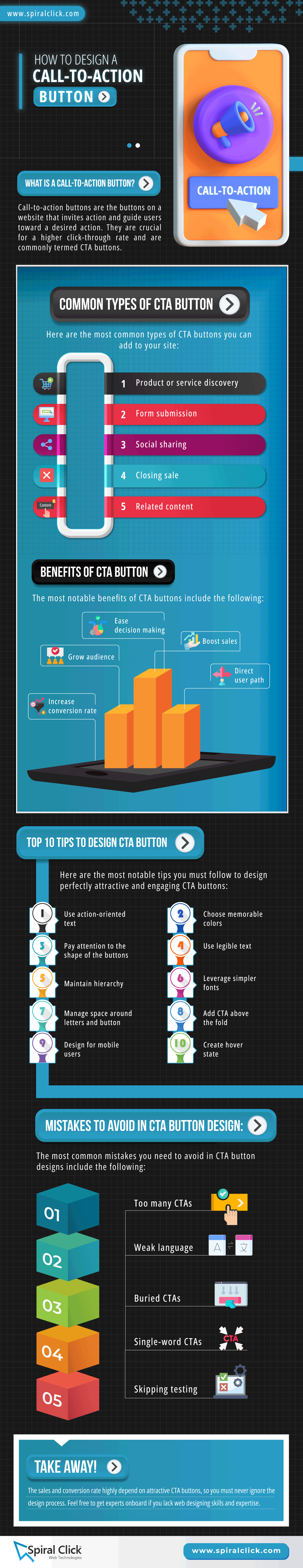
What is a Call-To-Action Button?
Call-to-action buttons are the buttons on a website that invites action and guide users toward a desired action. They are crucial for a higher click-through rate and are commonly termed CTA buttons.
Common Types of CTA Button
Here are the most common types of CTA buttons you can add to your site:
- Product or service discovery: These CTA buttons are used to encourage users to explore and learn more about a specific product or service. They typically have text like “Learn More” or “Discover Now.”
- Form submission: These CTA buttons are used to prompt users to fill out a form, whether it’s for a newsletter subscription, registration, or contact information. Examples of text on these buttons include “Submit,” “Sign Up,” or “Get Started.”
- Social sharing: These CTA buttons are designed to encourage users to share content from your website on their social media platforms. They often have icons of popular social media platforms, such as Facebook, Twitter, or Instagram, accompanied by text like “Share” or “Tweet.”
- Closing sale: These CTA buttons are used to motivate users to complete a purchase or transaction. They typically include text like “Buy Now,” “Add to Cart,” or “Checkout.”
- Related content: These CTA buttons are used to direct users to other relevant content on your website, such as related articles or recommended products. Examples of text on these buttons include “Read More,” “Explore,” or “See Also.”
By incorporating these different types of CTA buttons strategically on your website, you can guide users towards specific actions and improve user engagement and conversions.
Benefits of CTA Button
Call-to-action (CTA) buttons provide several benefits for websites and online businesses. Here are the most notable benefits of using CTA buttons:
- Ease decision making: CTA buttons guide users and make it easier for them to take action. By clearly defining a desired action, such as “Buy Now” or “Sign Up,” CTA buttons help users understand what steps to take, reducing confusion and hesitation.
- Grow audience: CTA buttons can be strategically used to grow your audience. For example, you can include a CTA button to encourage visitors to subscribe to your newsletter, follow you on social media, or join a membership program. By capturing user information or increasing your online presence, CTA buttons help expand your audience reach.
- Boost sales: CTA buttons play a vital role in driving sales and conversions. By placing a well-designed CTA button in the right position, such as on a product page or at the end of a sales funnel, you encourage users to take the next step in their buying journey. A compelling CTA button can increase the likelihood of users making a purchase, thus boosting sales.
- Increase conversion rate: CTA buttons are essential for increasing the conversion rate of your website. A conversion is when a user completes the desired action, such as making a purchase or filling out a form. By optimizing the design, placement, and text of your CTA buttons, you can improve the conversion rate and achieve higher user engagement and satisfaction.
- Direct user path: CTA buttons help guide users along a specific path on your website. Whether it’s leading them to a product page, a sign-up form, or a download link, CTA buttons serve as directional signposts that direct users to take action. By providing clear and compelling CTAs, you ensure that users follow a path that aligns with your business goals.
CTA buttons offer numerous benefits, including helping users make decisions, growing your audience, boosting sales, increasing conversion rates, and guiding users along a desired path. By implementing effective CTA button strategies, you can enhance user experience and achieve better results for your website or online business.
Top 10 Tips to Design CTA Button
Here are the top 10 tips to design CTA buttons:
- Use action-oriented text: Use clear and concise text that prompts the desired action, such as “Buy Now” or “Subscribe Today”.
- Choose memorable colors: Use colors that stand out and are visually appealing. Make sure the color doesn’t clash with the overall design of your website.
- Pay attention to the shape of the buttons: Choose a shape that is easily recognizable as a button, such as rectangles, squares, or circles. Avoid irregular or ambiguous shapes.
- Use legible text: Make sure the text on the button is easy to read, even at a glance. Use a font size and style that is appropriate and fits with your overall design.
- Maintain hierarchy: Make the CTA button visually prominent by using contrasting colors, bold text, or larger size compared to other elements on the page.
- Leverage simpler fonts: Stick to clean and professional fonts that are easy to read. Avoid using decorative or overly stylized fonts that can distract from the message.
- Manage space around letters and button: Give enough space around the CTA button to make it stand out and separate it from surrounding elements. Avoid cluttered or cramped designs.
- Add CTA above the fold: Place the CTA button in a prominent position on your website, preferably above the fold, where it is visible without the need to scroll.
- Design for mobile users: Ensure that your CTA button is responsive and looks good on mobile devices. Test its functionality and visibility on different screen sizes.
- Create hover state: Add a hover effect to the CTA button to provide feedback to users when they interact with it. This can be a color change, animation, or underline effect.
Following these tips will help you design CTA buttons that are attractive, engaging, and effective in driving user actions on your website.
Mistakes to Avoid in CTA Button Design:
The most common mistakes you need to avoid in CTA button designs include the following:
- Too many CTAs: Avoid cluttering your website with too many call-to-action buttons. Having multiple CTAs can confuse users and dilute the impact of each individual button. Instead, focus on prioritizing the most important actions and strategically placing CTAs to guide users effectively.
- Weak language: The text on your CTA buttons should be compelling and encourage users to take action. Avoid using weak or generic phrases that don’t convey a clear benefit. Instead, use strong, action-oriented language that creates a sense of urgency and motivates users to click.
- Buried CTAs: Ensure that your CTA buttons are easily visible and accessible to users. Avoid burying them within lengthy blocks of text or placing them in inconspicuous locations. Instead, position your CTAs prominently on the page where they are noticeable and stand out.
- Single-word CTAs: Avoid using single-word CTAs that don’t provide enough context or convey the desired action. For example, using a button that simply says “Submit” may not be as effective as using a button with more descriptive text like “Get Your Free eBook.” Instead, use clear and specific language that clearly communicates the value proposition of clicking the button.
- Skipping testing: Testing is crucial in CTA button design. Skipping the testing phase can prevent you from identifying potential issues or opportunities for improvement. Instead, conduct A/B testing to compare different versions of your CTAs and analyze user behavior to optimize their performance.
By avoiding these common mistakes in CTA button design, you can create more effective and engaging buttons that drive user actions and increase conversions.
Key Takeaways:
- Call-to-action (CTA) buttons are crucial elements on websites that guide users towards a desired action.
- There are various types of CTA buttons, including product discovery, form submission, social sharing, closing sale, and related content buttons.
- CTA buttons provide several benefits, such as easing decision making, growing audiences, boosting sales, increasing conversion rates, and directing user paths.
- To design effective CTA buttons, consider using action-oriented text, memorable colors, recognizable shapes, legible text, visual prominence, simpler fonts, proper spacing, above-the-fold placement, mobile responsiveness, and hover effects.
- Avoid common mistakes in CTA button design, such as using too many CTAs, using weak language, burying CTAs, using single-word CTAs, and skipping testing.
Remember that attractive CTA buttons are essential for improving sales and conversion rates. If you lack web designing skills, consider hiring experts to ensure high-quality design and maximize your website’s potential.
Recommended Posts:

Leave a comment