As an e-commerce store owner, you are always focused on converting your website visitors and making them buy your products. However, the best way to do this is not by forcing your visitors but instead by guiding them toward conversions. This is an important rule that should be applied to all aspects of your online store. Thus, when talking about conversions, one of the main aspects is your site CTA (Call to Action).
CTA doesn’t necessarily mean asking customers to buy instead it can be anything like registering, subscribing to newsletters, or downloading a demo. Customers in today’s age have countless options when it comes to purchasing products online. Therefore, they wouldn’t waste their time being lost in your store and if you don’t guide them each step of the conversion funnel, you may lose them. Your CTAs are the perfect solution to address this problem.
But how to get your CTAs right? If you are also seeking an answer to this then this guide is your answer. Keep reading to uncover the best CTA practices that influence leads and sales.
Top 5 Practices for CTA in E-commerce That Drive Sales
There is no single formula that lets you create the best call to action button. Instead, there are various practices, and consider them for your store and see what works best for your business. This article has handpicked some of the best practices to enhance your CTA. Be it the design, its language, and copy, creating a sense of urgency in it, or strategically placing it. Scroll down to learn more about these practices in detail.
Here are 5 practices for CTA in e-commerce that you can consider.
1. Enhance Your CTA Design
While everyone’s main focus is the words written on or around the CTA, you shouldn’t underestimate the importance of its design. Various design elements in a call to action play a vital role in its effectiveness, such as fonts, colors, and size. Let’s briefly look at these elements and learn how they catch customer’s attention:
- Color: The color you choose for the CTA is a significant design choice you make. It must be visually appealing than all other elements on the page. While there is no magic color for a CTA, you must ensure it matches your branding.
- Size: Your CTA size should be proportional to other elements of your website’s design and ensure the button makes the overall page layout look balanced.
- Shape: Shape can be anything, you can choose the one according to your brand identity as well. However, regardless of the shape you choose, just make sure the button appears clickable.
2. Create an Urgency
The main purpose of your CTA is to guide your customers in taking a particular action. For humans, the best technique that works for this is by making them feel they will miss out on something if they don’t take action. In the marketing world, this technique is called FOMO which stands for fear of missing out.
FOMO is based on three psychological aspects: urgency, scarcity, and social proof. Applying this to your CTAs is a good practice to encourage the customers to consider something in your store. These are time-sensitive types of messages that make the customers think if they don’t act now then it will be too late.
3. Use the Right CTA Language and Copy
Do you know marketers spend from hours to days to complete a sales copy? If not, then you shouldn’t be surprised because ad copy is crucial for conversion. The same goes for CTA, the language, phrases, and words you use, play a vital role in encouraging users to take any particular action.
The simple trick that works in CTA is to combine between simplicity and creativity. In easy words, your CTA shouldn’t be hard to read but at the same time, it should be different and reflect creativity. Lastly, you should ensure that the language you use is welcoming and friendly and not force the users to press the button.
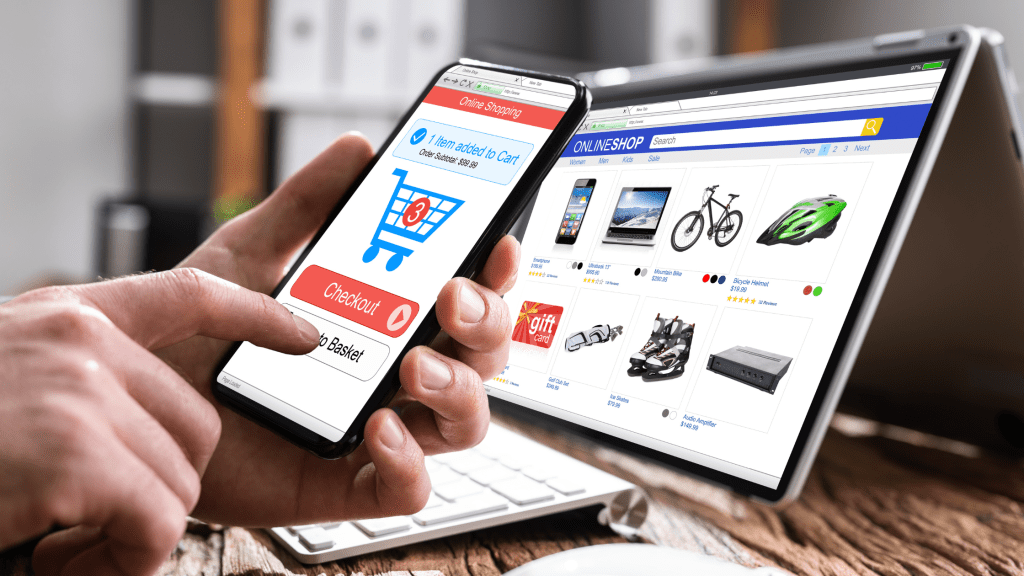
4. Optimize CTA for Mobile Commerce
If you are in the e-commerce industry, you already know the significance of mobile commerce. In the present year, the e-commerce industry is projected to hit $6.6 trillion and mobile commerce will take a grand total of $2.2 trillion from this. Therefore, every store owner is required to optimize everything on their website for mobile devices.
Therefore, the size, color, and design CTA practice discussed above go hand in hand with mobile optimization. All CTA elements must be compatible with different screens for boosted sales. However, this requires the expertise of professional developers to optimize CTA for phones.
For this, you can visit https://spiralclick.com/e-commerce, to acquire the expertise of professional developers and optimize your store CTAs for all devices.
5. Strategically Place Your CTA
Last but not least, the position where your CTA button appears also plays an important role in driving conversions. Therefore, you shouldn’t just randomly place CTAs. Instead, you should conduct a thorough research of your pages and find the best areas where they are expected to generate conversions.
The ideal place is usually considered “above the fold”. This refers to the part of the web page that appears on top before visitors scroll down. This prevents your customers from scrolling the entire page to find CTA which can be time-consuming.
Enhance Your CTA for Improved Conversion Rate
Be it the design, language, and words, or its placement, every small detail in a CTA is linked to its effectiveness. You can count on professional developers to enhance CTAs to get more clicks. Contact professionals now and enhance your call-to-action buttons.

Leave a comment